
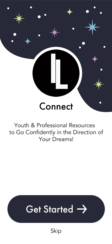
IL Connect App
IL Connect App
Giving foster children a voice through thoughtful, user-centered app design.


Designing with Purpose
The Alabama Foster Care System needed an app that kids would actually want to use. Through design workshops with administrators and foster youth, I gathered requirements and co-created storyboards to capture what mattered most. The final app made it easier for kids to ask for help, access records, and stay engaged.
Challenge
Before design intervention, end users of our B2B apps had a hard time getting their needs fully met by the new product.
Approach
I began running pre-dev design workshops where we would present user interviews, understand the product goal, and come out of the workshop with full storyboards of the user journey.
Outcome
Our clients finally felt that they were being listened to, change orders became less frequent, and end user satisfaction skyrocketed.
Alabama Foster Care Records App
My mission with this project was to design a mobile app for youths aging out of the foster care system in Alabama that would hold their important records, allow them access to counselors, and see upcoming events to attend. The counsellors wanted an app that was exciting for kids and more intuitive than their current website
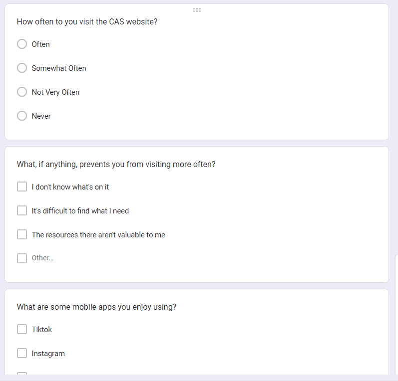
Step #1: User Interviews & Surveys
I created and sent our user surveys specifically for the current foster care youths, and the leaders asked everyone to fill these surveys out during a conference they were having.
I also met with stakeholders to understand their current processes, pain points, and what they'd like to see in a mobile app
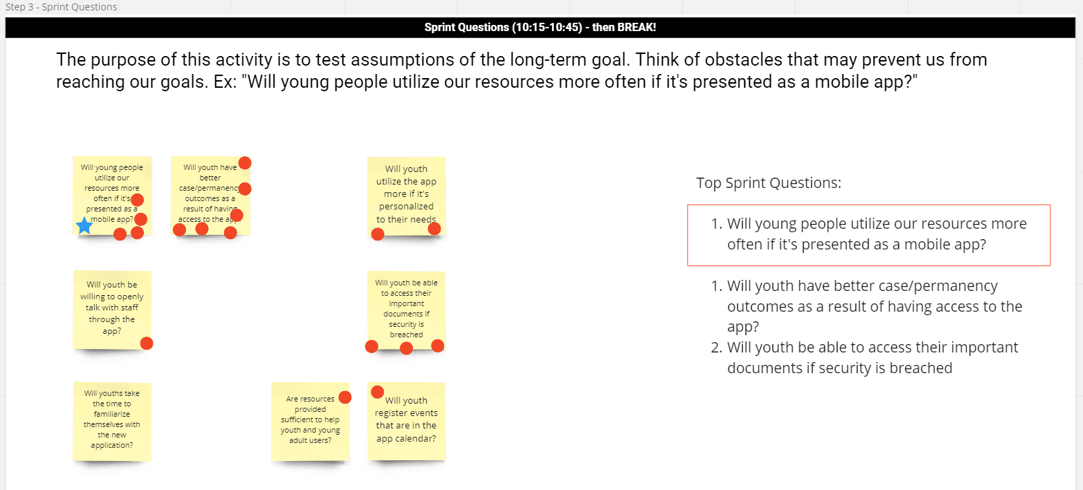
Step #2: Design Sprint Workshop
Design Sprint 2.0 is a weeklong workshop pioneered by the Google Ventures Team to tackle significant challenges and validate ideas rapidly. During the sprint, a dedicated team collaboratively explores a challenge, brainstorms potential solutions, and concludes with a wireframe designed collectively.
I managed to break this down into a 3-day workshop, where the stakeholders & development team worked collaboratively to define a product goal, build user journey maps, and ultimately storyboard the entire app.
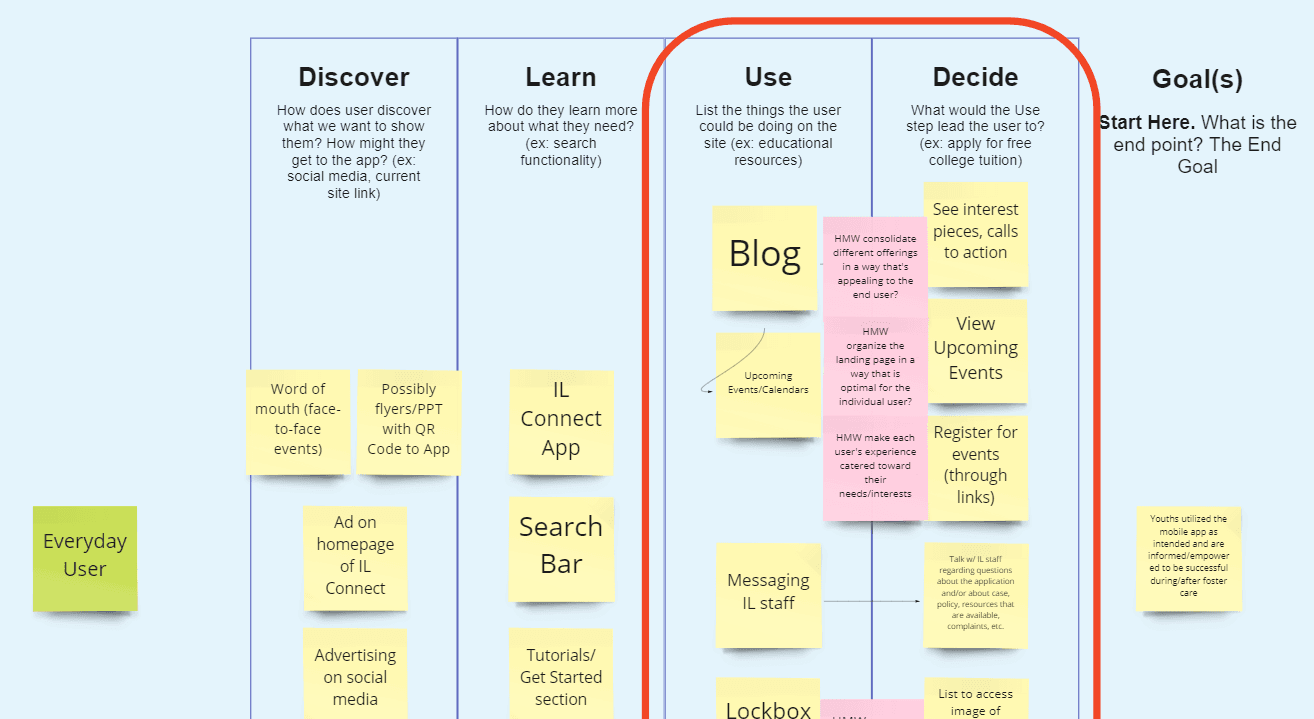
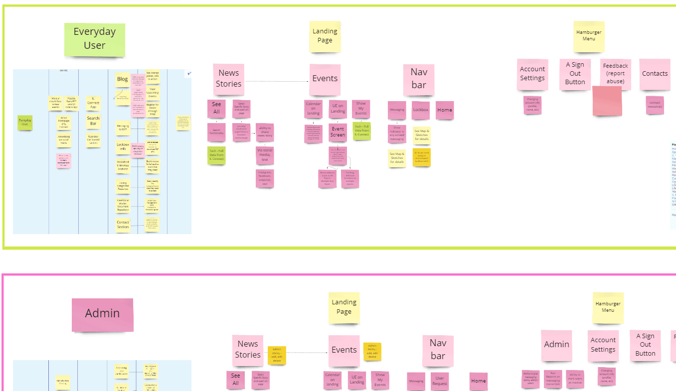
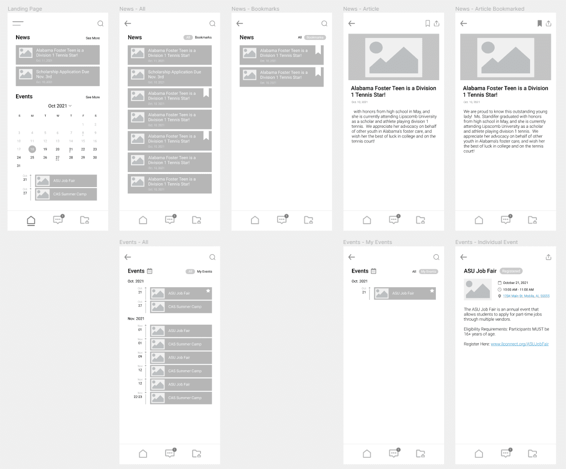
Step #3: Wireframes & Stakeholder Approval
Usually, I find it difficult to demo wireframes to clients who are not well-versed in the design world, because it's hard to see the vision without graphics. In this case, however, the user journeys were complex enough, and we had discussed this thoroughly enough with the client, that I felt comfortable giving them a wireframe so that we can make sure the functionality was what they were expecting. Sometimes it helps just to get a visual in front of stakeholders so that they can point out unique use cases, find issues they didn't think about, etc.
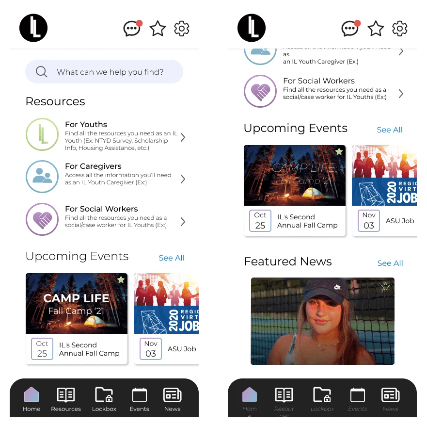
Step #4: Full Mockups & Building
Finally, I was able to build UI elements that were current (to 2018) and exciting for the kids & team! I also worked with a contract mobile dev throughout the process to make sure the UI/UX translated perfectly in production.
Challenge
Before design intervention, end users of our B2B apps had a hard time getting their needs fully met by the new product.
Approach
I began running pre-dev design workshops where we would present user interviews, understand the product goal, and come out of the workshop with full storyboards of the user journey.
Outcome
Our clients finally felt that they were being listened to, change orders became less frequent, and end user satisfaction skyrocketed.
Other Work
Alabama Foster Care Records App
My mission with this project was to design a mobile app for youths aging out of the foster care system in Alabama that would hold their important records, allow them access to counselors, and see upcoming events to attend. The counsellors wanted an app that was exciting for kids and more intuitive than their current website
Step #1: User Interviews & Surveys
I created and sent our user surveys specifically for the current foster care youths, and the leaders asked everyone to fill these surveys out during a conference they were having.
I also met with stakeholders to understand their current processes, pain points, and what they'd like to see in a mobile app
Step #2: Design Sprint Workshop
Design Sprint 2.0 is a weeklong workshop pioneered by the Google Ventures Team to tackle significant challenges and validate ideas rapidly. During the sprint, a dedicated team collaboratively explores a challenge, brainstorms potential solutions, and concludes with a wireframe designed collectively.
I managed to break this down into a 3-day workshop, where the stakeholders & development team worked collaboratively to define a product goal, build user journey maps, and ultimately storyboard the entire app.
Step #3: Wireframes & Stakeholder Approval
Usually, I find it difficult to demo wireframes to clients who are not well-versed in the design world, because it's hard to see the vision without graphics. In this case, however, the user journeys were complex enough, and we had discussed this thoroughly enough with the client, that I felt comfortable giving them a wireframe so that we can make sure the functionality was what they were expecting. Sometimes it helps just to get a visual in front of stakeholders so that they can point out unique use cases, find issues they didn't think about, etc.
Step #4: Full Mockups & Building
Finally, I was able to build UI elements that were current (to 2018) and exciting for the kids & team! I also worked with a contract mobile dev throughout the process to make sure the UI/UX translated perfectly in production.